Screen and display
Choose how a placement appears on your site (popup, banner, slide-in and more) and when it shows by itself.
Use the Screen & display tab to decide two things about a placement:
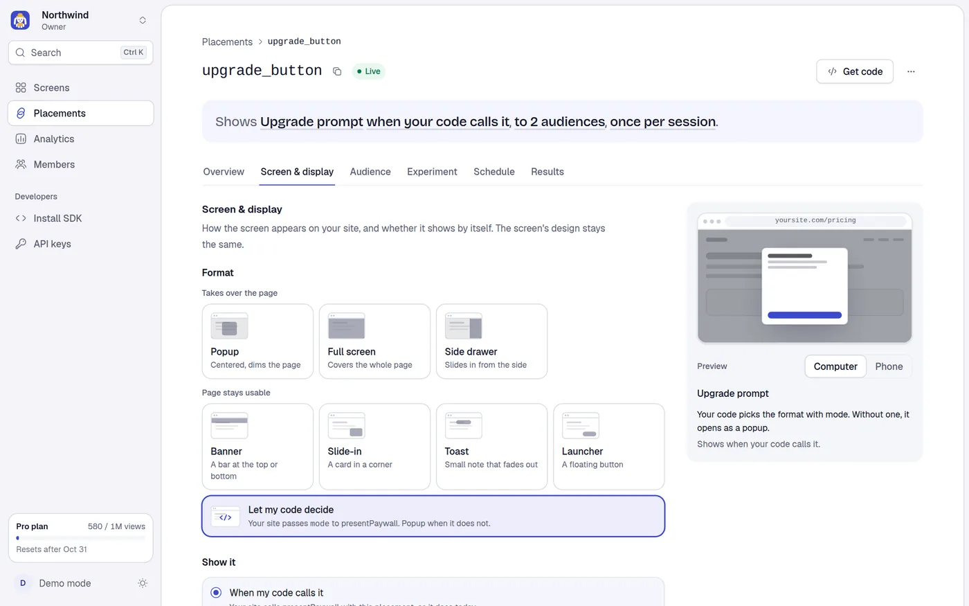
- How the screen appears: as a popup, a full screen, a banner, a slide-in, a toast, a side drawer or a floating launcher button.
- When it appears: only when your code calls it, or by itself on page load, after a delay, at a scroll depth, or when the visitor is about to leave.
None of this is part of the screen's design. The same screen can be a popup on one placement and a banner on another. The screen's design stays the same.
You edit a draft. Nothing changes on your site until you select Save in the bar at the bottom. See drafts and the save bar.
Format
The Format section shows cards in two groups, plus a last option for leaving the choice to your code.
| Group | Card | Hint on the card |
|---|---|---|
| Takes over the page | Popup | Centered, dims the page |
| Full screen | Covers the whole page | |
| Side drawer | Slides in from the side | |
| Page stays usable | Banner | A bar at the top or bottom |
| Slide-in | A card in a corner | |
| Toast | Small note that fades out | |
| Launcher | A floating button | |
| Let my code decide | Your site passes mode to presentPaywall. Popup when it does not. |
Let my code decide is the default for a new placement. It saves nothing about display: your code picks the mode in presentPaywall, and without one the SDK opens a popup. Your code can also override a format you set here. See Display modes in the SDK.
Options for each format
| Format | Options | Defaults |
|---|---|---|
| Popup | Size: Small 360 px, Medium 440 px, Large 560 px. | Medium |
| Full screen | None. | |
| Side drawer | Side: Left or Right. Size: Small 360 px, Medium 440 px, Large 560 px. | Right, Medium |
| Banner | Position: Top or Bottom. | Top |
| Slide-in | Position: Left, Center or Right. Size: Small 320 px, Medium 380 px, Large 440 px. | Right, Medium |
| Toast | Position: Top, Bottom or Corner. Size: Small 280 px, Medium 360 px, Large 440 px. Disappears after: 3 to 60 seconds. | Bottom, Medium, 6 seconds |
| Launcher | Button label: 1 to 24 characters. Opens as: Popup or Slide-in. Position: Left or Right. Size: the size of the screen it opens. | Opens as Popup, Right, Medium |
The form shows the pixel width under the size control, for example 440 px wide, and adds ; a bottom sheet on phones for a slide-in or ; full width on phones for a drawer.
How each format behaves on your site
| Format | Page behind it | Focus and keyboard | Closes with |
|---|---|---|---|
| Popup | Dimmed, scroll locked | Focus moves in and stays in. Focus returns to where it was when the popup closes. | Esc, a click on the dimmed area, or a close button in the screen |
| Full screen | Covered, scroll locked | Same as a popup | Esc or a close button in the screen |
| Side drawer | Dimmed 40%, scroll locked | Focus is kept inside | Esc, a click on the dimmed area, or a close button in the screen |
| Banner | Stays usable. The bar is full width, up to 40% of the viewport tall (it scrolls inside if longer). | Takes no focus, so it never interrupts typing | Esc while focus is inside it, or a close button in the screen |
| Slide-in | Stays usable. A card 16 px from the edge. Under 640 px wide it becomes a bottom sheet: full width, stuck to the bottom, up to 85% of the viewport tall. | Takes no focus | Esc while focus is inside it, or a close button in the screen |
| Toast | Stays usable | Takes no focus. Read out politely by screen readers. | Fades out by itself, Esc while focus is inside it, or a close button in the screen |
| Launcher | A floating button | A normal button | Not a screen. See below. |
The SDK adds no close button of its own: a screen closes with a button in its own design. The templates include one. If you design your own screen, add a button with the action Close the screen (see Actions and links).
Toast. It waits while the visitor points at it, reads it with the keyboard, or has another tab in front, and it never leaves sooner than 2 seconds after they let go. When the time runs out it counts as closed but sends no close event. On phones a toast is as wide as the screen minus 32 px, and Corner becomes bottom center.
Launcher. It is a button, not a screen. It shows once the audience and holdout let the visitor through, and it needs a trigger to appear (choosing Launcher while the trigger is When my code calls it switches the trigger to When the page loads). One launcher button shows per page. When the visitor presses it, the screen opens as a popup or a slide-in and the button hides. When the screen closes the button comes back and takes focus. A slide-in opened from a launcher sits on the same side as the button. The launcher does not use up the page's one screen and does not block other triggers. A frequency limit does not hide the button: it is checked only when the screen would open, and pressing the button on purpose is never held back by it.
Show it
The Show it section chooses the trigger.
| Option | Shows when | Limits |
|---|---|---|
| When my code calls it | Your code calls presentPaywall (or mounts the placement). This is the default and the same as no trigger. | |
| When the page loads | The page has finished loading. Also after a route change in a single-page app. | |
| After N seconds | N seconds after the page loads (counted from when the SDK has set up the page). | 1 to 600 |
| When the visitor scrolls N% | The visitor has scrolled N% of the page height. A page too short to scroll counts as 100%. | 10 to 100 |
| When the visitor is about to leave | The pointer leaves through the top of the window. Computers only: phones and tablets never trigger it. |
For the number options, click into the number box inside the option; that selects the option.
Any option other than When my code calls it makes the placement show by itself. For that your site calls startAutoPlacements() once on every page. The tab reminds you with Your site needs startAutoPlacements() once, on every page. and a Get the code link to Install SDK. See Auto placements.
Pages
This section appears when the trigger shows by itself.
- All pages: the trigger arms on every page.
- Only these pages: type one path pattern per row (placeholder
/pricing). Add page adds a row; the suggestion buttons+ /pricingand+ /blog/*fill a row for you; the remove button at the end of a row deletes it.
Rules for patterns:
- Each starts with
/and is at most 200 characters. At most 20 patterns per placement. *matches anything, including/. So/blog/*matches/blog/aand/blog/a/b.- A trailing
/does not matter:/pricing/matches/pricing. - They are compared with the page's path only (
location.pathname), not the query string or the hash. - If you choose Only these pages and leave every row empty, saving fails with Add a page, or choose All pages.
How often
When the placement shows by itself, has no frequency limit yet, is not a launcher, and you are signed in to an account (not the browser-only demo), a How often section offers a checkbox: Limit to once per session, checked by default. It says that each visitor sees the screen once per visit, and that without a limit it shows on every page view and uses your monthly views faster. Saving with it checked also saves a frequency limit of 1 per visit in the Audience tab. Uncheck it to show on every page view.
Saving takes two requests: the display first, then the limit. If the display saves but the limit does not, a toast says Display saved, but the limit wasn't with Retry, and the Audience tab shows Once per session wasn't saved. with Set it now.
Priority
Priority appears when the trigger shows by itself and at least one other placement in the project shows by itself. It is a whole number from 0 to 100 (default 0). When several placements are due on the same page at the same moment, the higher priority goes first. Equal priorities go to the placement created first. Only one screen shows per page view.
Save, validation and errors
| Field | Rule | Message |
|---|---|---|
| Button label (Launcher) | Required, 1 to 24 characters | Add a label of up to 24 characters / Keep the label to 24 characters |
| Disappears after (Toast) | Whole seconds, 3 to 60 | Show a toast for at least 3 seconds / Show a toast for at most 60 seconds / Use whole seconds |
| After N seconds | Whole seconds, 1 to 600 | Wait at least 1 second / Wait at most 600 seconds / Say how many seconds to wait |
| When the visitor scrolls N% | Whole percent, 10 to 100 | Scroll at least 10% / Scroll at most 100% / Say how far the visitor scrolls |
| Pages | Start with /, 200 characters, 20 rows | Start each page with /, like /pricing / Keep each page under 200 characters / Add at most 20 pages |
| Priority | Whole number, 0 to 100 | Priority is 0 to 100 / Use a whole number |
Errors show under the field when you select Save. See the save bar for what else can fail.
What the SDK does with these settings
The delivery response for a placement includes its display and trigger. For a call to presentPaywall({ paywall: { placement: 'key' } }):
- If your code passes
mode, that wins and the placement's format, position, size and duration are ignored. - Otherwise the placement's format applies.
- Otherwise the screen opens as a medium popup.
Placements with a trigger are returned by startAutoPlacements(), in priority order. A placement whose screen is not published is left out. An SDK that predates the toast, drawer and launcher formats is sent no display for those three, so it opens a popup. See Versioning.
Related
Placement detail page
Read what a placement does, choose its screen, and learn how tabs, drafts, the save bar, the preview and the unsaved-changes guard work.
Audience
Show different screens to different visitors, limit how often a visitor sees a placement, and hold some visitors back to measure its effect.