Components
Every component you can add to a screen, how to add and nest it, and the controls that every component shares.
Components are the building blocks of a screen. Use this section to find what a component is for, how to add it, where it can go, and what each control in its design panel does.
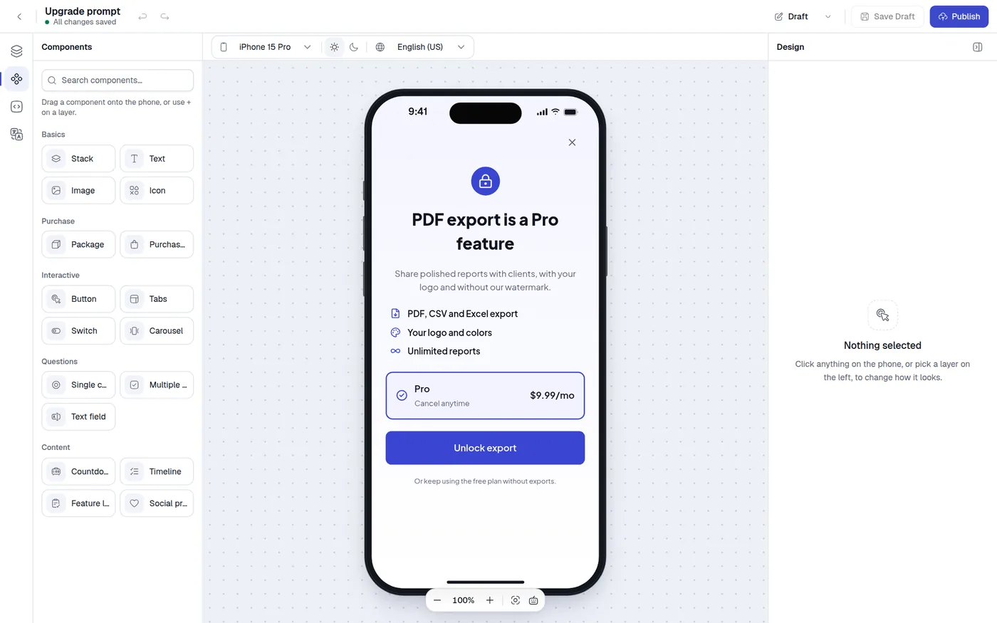
The components
The Components panel groups the palette like this. Each name links to its page.
| Group | Component | What it is for | Type in the JSON |
|---|---|---|---|
| Basics | Stack | Arrange other components in a column, a row or in layers. | stack |
| Basics | Text | Headlines, body text, prices and links. | text |
| Basics | Image | A picture from your image library. | image |
| Basics | Icon | A small symbol, tinted with any color. | icon |
| Purchase | Package | A plan card the visitor can pick. Adds two cards. | package |
| Purchase | Purchase button | The button that buys the selected plan. | purchase_button |
| Interactive | Button | A button that closes the screen, opens a link, goes to another screen or runs your code. | button |
| Interactive | Tabs | Groups of content the visitor switches between. | tabs |
| Interactive | Switch | An on and off toggle that swaps content. | tabs |
| Interactive | Carousel | Swipeable pages with page dots. | carousel |
| Questions | Single choice | Pick one answer. | input_single_choice |
| Questions | Multiple choice | Pick one or more answers. | input_multiple_choice |
| Questions | Text field | A line of typed text. | input_text |
| Content | Countdown | A timer that counts down to a date. | countdown |
| Content | Timeline | Steps with icons and connecting lines. | timeline |
| Content | Feature list | Rows of a check mark and a line of text. | stack |
| Content | Social proof | A rating summary and one review card. | stack |
Two more parts are not in the palette, because you add them from Layers: the Header and footer.
The palette offers only these components. Other kinds of component are not available in the editor.
Add a component
There are three ways, and all of them respect the nesting rules below.
- Drag from the palette. Open Components (press 2), then drag a tile onto the phone. A dashed outline and the label Add to plus a layer name show where it will land.
- Use the plus button in Layers. Hover a layer that can hold children and click +, then choose a group and a component. The menu only shows what is allowed there.
- Paste or duplicate. Copy a layer and paste it, or duplicate it from its … menu or with ⌘D (Ctrl+D). See Layers.
The palette has no click-to-add button and no keyboard shortcut for adding. A new component is selected as soon as it lands, so you can style it straight away.
New components come with starter text in your default language, for example New Text or Feature 1. Replace it before publishing, because publishing is blocked when a text is empty.
Where components can go
The editor uses one set of rules for the plus menu, drag and drop, paste and duplicate, so you cannot build a tree that the renderer would draw wrongly. When something is not allowed, you see a message that says why.
| Rule | Detail |
|---|---|
| Only some layers hold children | Stacks (including feature lists and social proof), the header and footer, and the inner stacks of a package, purchase button, button, answer and tab button. Text, images, icons, text fields, countdowns, timelines and carousels have no plus button of their own. |
| Tappable layers cannot hold interactive ones | A Button, Purchase button, Package, answer and tab button are tappable. They cannot contain buttons, plans, questions, text fields, tabs, carousels or other tappable layers. Text, images, icons and stacks are fine inside them. The message reads A button is tappable, so it can't hold buttons, plans, questions or other tappable layers. |
| Answers belong in a question | An answer cannot be placed anywhere else, and a question cannot hold another question. |
| Carousel pages are stacks | Only stacks can be pages. Add other components inside a page. |
| No loops | A layer cannot go inside itself. |
When you drop a component on a layer that cannot hold it, the editor tries the layer's parent, then the next parent up, and adds it after the layer it landed on.
Shared controls
Most design panels reuse the same controls. They behave the same everywhere, so they are described once here, and each component page lists which ones it has.
Plus and minus sections
Optional groups such as Appearance, Fill, Border, Drop Shadow and Color Overlay have a heading with a + button. Click it to turn the group on with sensible starting values (Add fill, Add border and so on). Click − (Remove fill) to turn it off again.
Number fields
Type a number and press Enter or click away to apply it. Letters are ignored. Where a minimum applies, a smaller number becomes the minimum. Sizes and spacing are in pixels.
Layout
| Control | Values |
|---|---|
| Direction | Horizontal (a row), Vertical (a column), or Z-Layer (children stacked on top of each other). |
| Alignment | Across the direction. For a row: Top, Center, Bottom. For a column: Leading, Center, Trailing. For Z-Layer a menu offers nine positions such as top leading, center or bottom trailing. |
| Distribution | Along the direction, not for Z-Layer: Start, Center, End, Space between, Space around, Space evenly. |
| Gap | The space between children, in pixels. |
Leading and trailing are the start and end sides of a line of text, which in a left-to-right language means left and right.
Size
Width and Height each have a menu:
| Value | Meaning |
|---|---|
| Fill | As large as the parent allows. |
| Fit content | As large as the content needs. |
| Fixed | An exact size in pixels. A number box appears. |
| Relative | A share of the parent, where 1 is all of it and 0.5 is half. A number box appears. |
Padding and margin
Padding is space inside the layer, and Margin is space outside it. Each shows two boxes by default: the left one sets leading and trailing together, the right one sets top and bottom together. Click the expand button (Edit each side independently) to get Top, Bottom, Leading and Trailing. Click again (Simplify to horizontal/vertical) to go back. The panel opens expanded if the sides already differ.
Appearance and shape
Appearance sets a Shape: Rectangle, Circle or Pill. A rectangle or pill adds four radius fields: Top leading (left), Top trailing (right), Bottom leading (left) and Bottom trailing (right). A circle has no radius. Some components offer only Rectangle and Circle.
Fill, color and gradient
A Fill is a color or an image behind the layer. Every color field in the panel works the same way:
- A swatch opens a picker, and a text box takes a hex value such as
#2563EB. - Fields that allow gradients have a menu with Solid, Linear Gradient and Radial Gradient. A linear gradient has an Angle. Each stop has a color and a percent, and Add stop adds one. A gradient keeps at least two stops. Icon, shadow and page-dot colors are solid only.
- If your screen has brand colors, small round swatches under the field link the color to one (Use plus the name). A linked color shows its name and a Detach button.
- In dark mode the field edits the dark color. See Colors and dark mode.
- If a color has a shape the editor cannot show, the field says This color can't be edited here. and leaves it untouched.
Where a layer can show an image as its fill, a Color or Image switch appears, with Fit Mode (Fit content or Fill) and an optional Color Overlay.
Border and drop shadow
Border has a Color and a Width in pixels, and starts at 1 pixel in a light gray. Drop Shadow has X, Y and Radius, plus a solid Color, and starts at 0, 2 and 4 in black.
Default and When selected
On a layer inside a Package, a Tab button or an Answer, the panel starts with two tabs: Default and When selected. Default is the normal look. When selected is the look while the plan, tab or answer is chosen. It starts as a copy of Default, and you change only what should differ, such as the border color or a check mark.
The tabs appear for stacks, texts and icons that sit anywhere inside one of those three, and for the package, tab button and answer layers themselves. On other layers they would never take effect, so they are hidden. See Package.