Editor tour
A guided look at the Miniwall visual editor, from the top bar to the design panel, and how a screen is built.
The visual editor is where you build a screen: a paywall, an upgrade prompt, a promotion, an onboarding step or a survey. You arrange components on a phone-shaped canvas, style them in a panel, and publish. Your site shows the new version without a deploy.
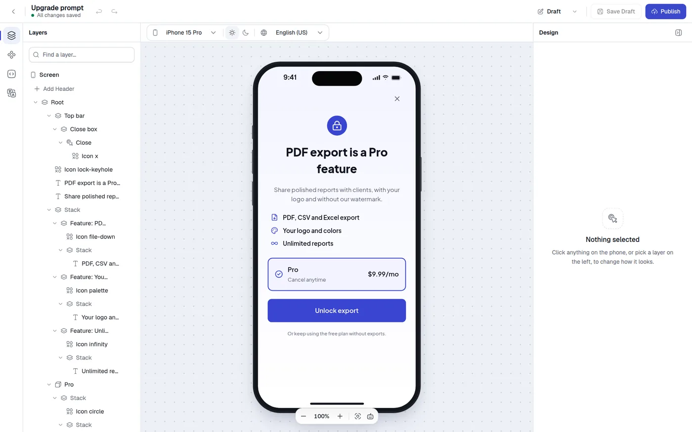
Open it from Screens in the dashboard by creating a screen or opening an existing one. The editor takes the full window and has five areas.
| Area | Where | What it is for |
|---|---|---|
| Top bar | Across the top | Name, save status, undo and redo, Draft and Published, Save Draft, Publish |
| Left rail and panel | Left edge | Layers, Components, Variables and Translations |
| View bar | Above the canvas | Preview device, light or dark, preview language |
| Canvas | Center | The live screen, zoom controls |
| Design panel | Right edge | The look and settings of whatever you select |
The canvas is not a mock-up. It draws your screen with the same renderer your site uses, so what you see is what visitors get.
Top bar
From left to right:
- Back to screens returns to the screen list.
- The screen name, with a status line under it. The status reads All changes saved, Unsaved changes, Saving…, Couldn't save, retrying, Viewing published or View only.
- Undo and Redo. The editor keeps your last 100 edits. Typing in one field counts as one step if you pause for less than a second. Undo and Redo are off while you view the published version.
- A switcher labelled Draft or Published. It opens a Versions menu where you switch between the version you edit and the version that is live, discard your draft changes, or open Version history.
- Save Draft saves now. The editor also saves by itself two seconds after your last edit.
- Publish makes your draft live. If the screen has problems, the button becomes a red N Issues button that lists what to fix, with a Select layer button for each one.
If the screen was saved in another tab or by a teammate after you opened it, the editor pauses autosave and asks you to choose Keep my version or Load the latest version.
Saving, publishing, versions and the publish checks are covered in Publish and versions and Validation.
If your role is Viewer, the editor opens read-only: the side panels are disabled, nothing saves and a banner says so.
Left rail and panels
The narrow rail on the left has four buttons. Click one to open its panel, and click the open one again to collapse the panel.
| Button | Key | Panel |
|---|---|---|
| Layers | 1 | The structure of the screen as a tree. See Layers |
| Components | 2 | The palette you drag new components from |
| Variables | 3 | Price and plan variables, and your own variables. See Variables |
| Translations | 4 | Languages and translated text. See Localization |
Press the backslash key to hide the left side entirely, and press it again to bring back the panel you had open. The editor remembers which panel was open in your browser.
When you view the published version, which is read-only, the Components button leaves the rail. The Translations button stays but is disabled, with the tooltip Switch to Draft to edit translations.
Components panel
The Components panel has a Search components… box and the palette in five groups. Hover a tile and the tooltip says Drag … onto the canvas.
| Group | Components |
|---|---|
| Basics | Stack, Text, Image, Icon |
| Purchase | Package, Purchase button |
| Interactive | Button, Tabs, Switch, Carousel |
| Questions | Single choice, Multiple choice, Text field |
| Content | Countdown, Timeline, Feature list, Social proof |
Drag a tile onto the phone, or use the + button on a layer in the Layers panel. Search filters by name, and groups with no match disappear. Every component has its own page under Components.
Getting started card
On a draft, a Getting started card sits at the bottom of the Layers and Components panels. It has four steps that tick themselves off: click anything on the phone, set your brand colors (with a Show me link), try dark mode and a desktop screen, and publish. The close button hides it for good in this browser.
View bar
The bar above the canvas controls how the preview looks. None of it is saved with the screen.
- Preview device picks the phone, tablet or website frame. See Canvas and devices.
- The sun and moon buttons, Light mode and Dark mode, preview the screen in each color mode. The editor never follows your browser's own dark setting, so the preview only changes when you ask.
- Preview language shows the screen in any language you have added. Text you have not translated falls back to the default language.
- When the design panel is hidden, Show design panel appears at the right end of the bar.
Canvas
The canvas shows one device with your screen inside it. Click anything on the screen to select it, and its settings open on the right. A floating toolbar at the bottom has Zoom out, the zoom percentage, Zoom in, Center the device and a Keyboard shortcuts list. Details are on Canvas and devices.
Design panel
The panel on the right shows the settings of the selected layer. It has:
- A breadcrumb with up to two parent layers. Click one to select it.
- The layer name and its kind, such as Text or Package.
- The controls for that kind of layer. Every component page lists them.
- A Hide design panel button. Your choice is remembered in your browser.
With nothing selected the panel says Nothing selected. If you select a layer that has no settings of its own, it says No settings here yet and tells you to select what is inside it.
When you select several layers, a note at the top says how many other layers of the same kind get your style changes. Layers of a different kind stay as they are.
Selecting Screen in the Layers panel, or clicking the gray area around the phone, opens the settings of the whole screen. See Screen settings.
How a screen is built
Every screen has the same skeleton. In the Layers panel it looks like this:
Screen
  Header          optional, stays at the top
  Stack           the content, scrolls when it is long
Footer optional, stays at the bottom| Part | What it does |
|---|---|
| Screen | The whole screen. Holds the background and your brand colors. |
| Header | An optional bar pinned to the top. Add it with Add Header in Layers. |
| Root Stack | The main content. It is a stack like any other, and it scrolls when the content is taller than the screen. |
| Footer | An optional bar pinned to the bottom, always visible. Add it with Add Footer in Layers. Use it for the purchase button. |
Everything you add goes inside a stack, and stacks can hold more stacks. A stack arranges its children in a row, a column or in layers on top of each other. Almost all layout is built by nesting stacks and adjusting spacing.
Some components are wrappers around a stack. A Button, Package, Purchase button, Header, Footer and Answer each have one inner stack that carries their look. The editor hides that inner stack in Layers and shows its children directly, and the design panel shows the stack's controls for you.
Text is stored separately from the layout, one entry per language. That is why translating, and the Translations panel, work without touching the structure.
Where to go next
Canvas and devices
Devices, zoom, selection and preview states.
Layers
Select, rename, reorder and nest layers.
Components
Every component, its settings and where it can go.
Screen settings
Background and brand colors for the whole screen.
Related
Account and sign-in
Create an account, confirm your email, sign in, reset a password, accept an invitation, choose light or dark, and sign out.
Canvas and devices
Preview your screen on phones, tablets and a website window, zoom and pan, select layers on the canvas, and understand what the preview remembers.